Projects
WEB DEVELOPER & DESIGNER
Website of the studio «OneVideo»
Photography, video filming, video editing, photo sessions ..

Logo design
|
The development of the site «OneVideo» I started with the development of the logo.
And so I have the title «OneVideo» , which doesn't sound bad in itself.
One - translated as: one, number one, number one.
My task is to visualize the logo in such a way that it would not lose its pronounced «primacy», but I did not want to use «sleepers» (mighty numbers of ones).
I think I'm lucky! After all, it is much more pleasant to shape the style of the future website yourself, laying its shapes and colors in the LOGO itself!
Sometimes, of course, there may be acceptable variants of logos that you can work with, but unfortunately this does not happen often.
Here I briefly mention the stage of logo development, and suggest looking at the finished result.
Since this article is about the development of the «OneVideo» website , I tried to put in a separate article the story of how the logo itself was created logo development «OneVideo».

Logo |

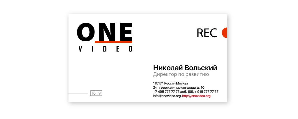
Business card |

Color scheme
|
After we got the logo and the final recipient liked it as well, I began to form the color scheme for the web site under development «OneVideo».
The main color scheme for the «OneVideo» site , I chose a pair: Black and White.
I wanted to develop a rather «strict» stylistically site. It was decided to use black to mark clear boundaries (menu line, footer, section boundaries).
And for the soft binding elements of the site, I used intermediate colors, between Black and White.
So that the site does not turn out to be completely «monotonous», I used Accent colors - colors that give pleasant bright «colored spots».
In my case, it is bright orange and not much pale turquoise , which mutes the excessive «color mood» on the site.
Website style colors |

SASS variable colors |


Topological scheme of pages
|
The basis for the formation of the topological scheme of the pages of the website «OneVideo», it was decided to put the main directions of the shooting studio.
Besides, I did not want to offer the client a so-called «dead» site - a site without self-development.
So I decided to give the «OneVideo» website a personal news blog where the site owners can post their news about the photos and videos they've taken.
Also, the site has the corresponding galleries:
The feedback form is no longer a required module on the website, but surveys have shown that people view the site, which is called «before the submission form».
And not finding it, they rejoice that the competitor's site is not completed).
I always place the frame form in the «Contacts» section of the site, while completely rewriting all the CSS-styles so that it fits as organically as possible into the final site design.
Site page topology |


